
Statistical Interpretation
of Climate Data
Variation in Climate Data
Climate data fluctuates daily, monthly, seasonally, and annually due to the inherent chaotic dynamism of the climate system. This system is influenced by various cause-and-effect factors that randomly affect the weather we experience. When we graph the measurement of a single weather variable over numerous observations, we often observe a pattern known as the normal distribution. The normal distribution holds importance in statistics because most real-world measurements, such as human height, test scores, blood pressure, and so on, when graphed, exhibit this symmetrically shaped bell curve (Figure 1).
Some important charactersistic of the normal distribution include:
- The mean, median, and mode for the observations are all found at the center of the normal distribution.
- The left and right sides the normal distribution mirror each other.
- Most values occur near the mean, with probabilities tapering off smoothly toward the end of the bell curve.
- The total area under the bell curve is 1.00 or 100%, we can use this fact to determine the probability of occurrence of an observation.
- Statistians use two parameters to desbribe the normal distibition of a datset, μ (mu) — the mean, which describes the center and σ (sigma) — the standard deviation, which describes the spread of the data. From these parameters, I have calculated the 5% and 95% probability thresholds for the daily maximum and minimum data from 1951 to 2000 described here so we can identify extremely warm and cold events.
- About 68% of values in a dataset lie within 1 standard deviation of the mean, 95% lie within 2 standard deviations, and 99.7% lie within 3 standard deviations.
On this website, you will find graphs that display the change in winter mean temperature, winter degree days < 0°C, winter snowfall, or winter rainfall from 1901 to 2025. These graphs include best-fit linear regression lines that represent the mean of the climate variable, the 5% probability value, and the 95% probability value over time. The 5% amd 95% probability values are useful in identifying extreme events. For instance, Figure 2 illustrates Cypress Ski Resort’s winter mean temperatures from 1901 to 2025. Since 1951, three winter seasons can be considered as being exceptionaly warm because they were on or above the 95% probability threshold - 1957/58, 1991/92, and 2014/15. Conversely, since 1951, four winter seasons can be considered as being exceptionaly cold because they were below the 5% probability threshold - 1956/57, 1968/69, 1971/72, and 2078/79.
Finding Data Trends - Best-Fit Lines
A best-fit line (or trendline) is a straight or curved line on a scatterplot (graph) that best represents the underlying trend of a set of data points. Best-fit lines are used to mathematically model the relationship of two variables suspected of being influenced by cause-and-effect and to make predictions.
The creation of a best-fit line from a set of data is easily done by a statistical technique known as linear regression. In a simple two variable linear regression analysis, one dependent variable is mathematically regressed with only one independent variable. One outcome of this analysis is to derive an equation for a best-fit line model of the relationship between the dependent (called Y) and independent (called X) variables. For a linear, two variable situation, this equation will have the mathematical form:
Y = a +/- b X
Where,
Y is the value of the dependent variable,
X is the value of the independent variable,
a is the intercept of the regression line on the Y-axis when X = 0,
and b is the slope of the regression line. Also called the regression coefficient. The sign (+ or -) of this coefficient describes the direction of the relationship between the X and Y variables. A positive slope indicates that an increase in X leads to an increase in Y. A negative slope indicates that an increase in X leads to a decrease in Y. The regression coefficient also describes the rate of change in the dependent variable Y relative to the independent variable X.
Figure 3 shows a scatterplot of surface minimum atmospheric pressure (mb - millibars) and surface maximum wind speed (kph - kilometers per hour) for 312 measurements of tropical storms and hurricanes that formed in 1996 to 2000 in the Atlantic, East Pacific, and West Pacific oceans. The regression equation for the best-fit line was determined to be:
Y = 2296.49 - 2.21488 X
From this equation, we can generate predictions of Y by knowing the value of X. For example, if we know X to be 950 mb, then it follows that we can calculate the corresponding wind speed as:
Y = 2296.49 – 2.21488 (950) = 2296.49 - 2104.25 = 192.24 kph
Correlation Coefficient
The correlation coefficient is a statistic that measures the strength of the correlation between independent and dependent variables in linear regression analysis. The symbol "r" often represents this statistic (see Figure 3). The value of the correlation coefficient ranges from 1.00 to -1.00 (see Figures 4 and 5). A value of 0.0 indicates that there is absolutely no relationship between the X and Y variables. The strength of the relationship between the X and Y variables increases as the value of r approaches 1.00 and -1.00. Perfect correlation occurs if r equals either 1.00 (perfect positive) or -1.00 (perfect negative). Positive correlation coefficients indicate that an increase in the value of the X variable results in an increase in the value of the Y variable. Negative correlation coefficients indicate that an increase in the value of the X variable results in a decrease in the value of the Y variable.
Associated with the calculation of the correlation coefficient is a probability value. This value determines the probability of finding a correlation at least as strong as the one found in an analysis purely by random chance, assuming no real relationship exists. In the analysis of surface minimum atmospheric pressure and surface maximum wind speed measurements for 312 tropical storms and hurricanes, the probabability value was found to be less than (<) 0.0001 or 1 in 10,000 (P < 0.0001 in Figure 3). Probabability values are provided for the various linear regression analyses found on this website.

Figure 1 Presents a histogram plot of the observed daily maximum temperatures in degrees Celsius for the month of September from 1951 to 2025. The observations have been grouped into 1°C intervals. The graph includes the mean and the 5% and 95% probability thresholds. The 5% threshold indicates that 5% of the observations in the dataset fall below this value, while the 95% threshold indicates that 95% of the observations fall below this value. Notably, 90% of the observations fall between these two thresholds or 328.5 days in a typical year of 365 days (365 x 0.90). Observations that fall outside these two thresholds are usually consider rare or extreme. There should be 18.25 days below the 5% probability and 18.25 days above the 95% probability in a year of 365 days.

Figure 2 Yearly observations of winter mean temperatures (°C) from 1901 to 2025 at Cypress Mountain Ski Resort (elevation 1124 m) as derived from the climate database ClimateBC. The orange line is the best-fit linear regression line and the green dash lines show the 5% and 95% prediction thresholds.
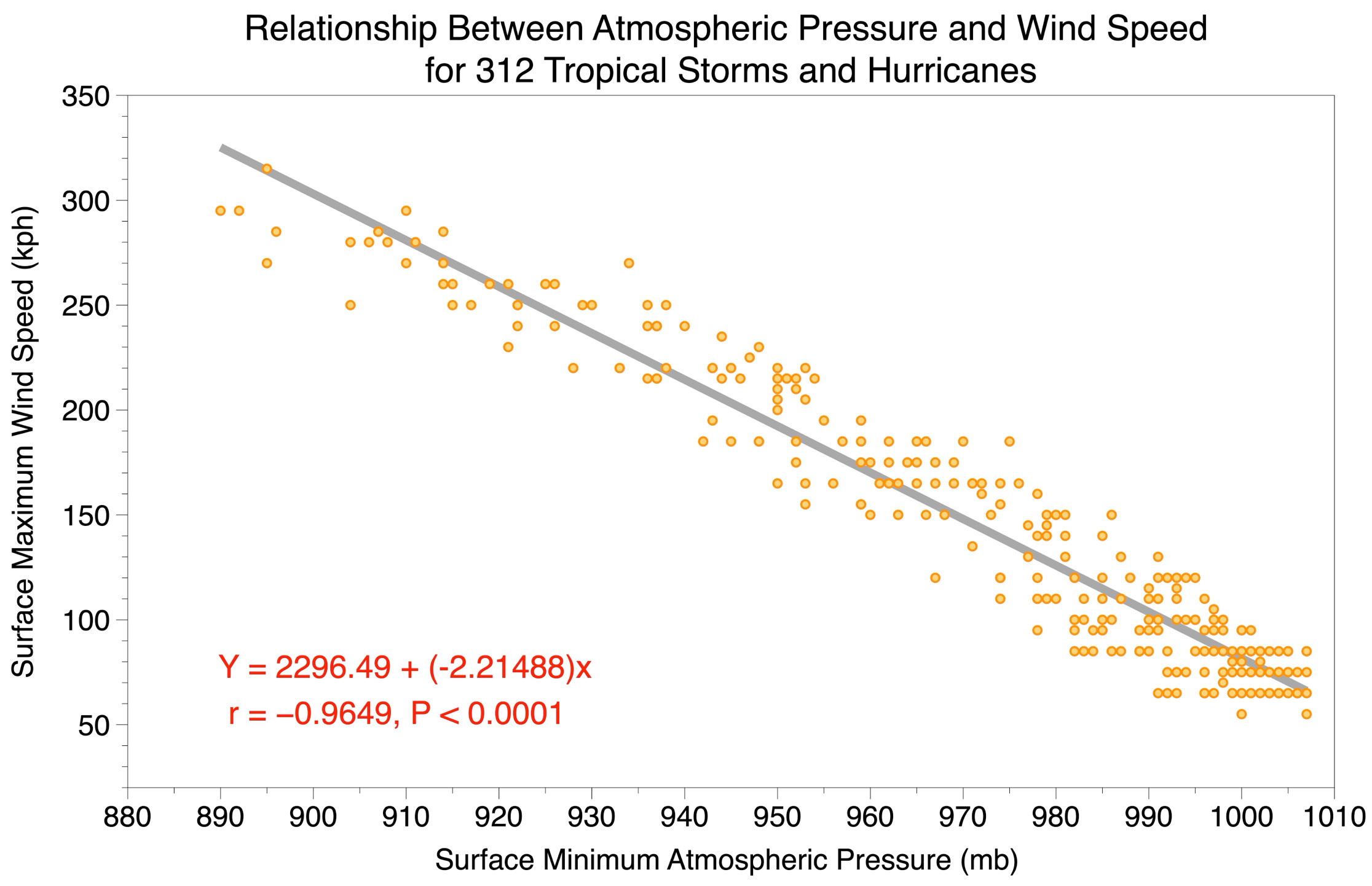
Figure 3 Regression best-fit line plotted on a scatterplot of surface minimum atmospheric pressure (X-variable) and surface maximum wind speed (Y-variable) measurements for 312 tropical storms and hurricanes. Also shown is the correlation coefficient (r = -0.9649) and its associated statistical significance or probability value (P < 0.0001).
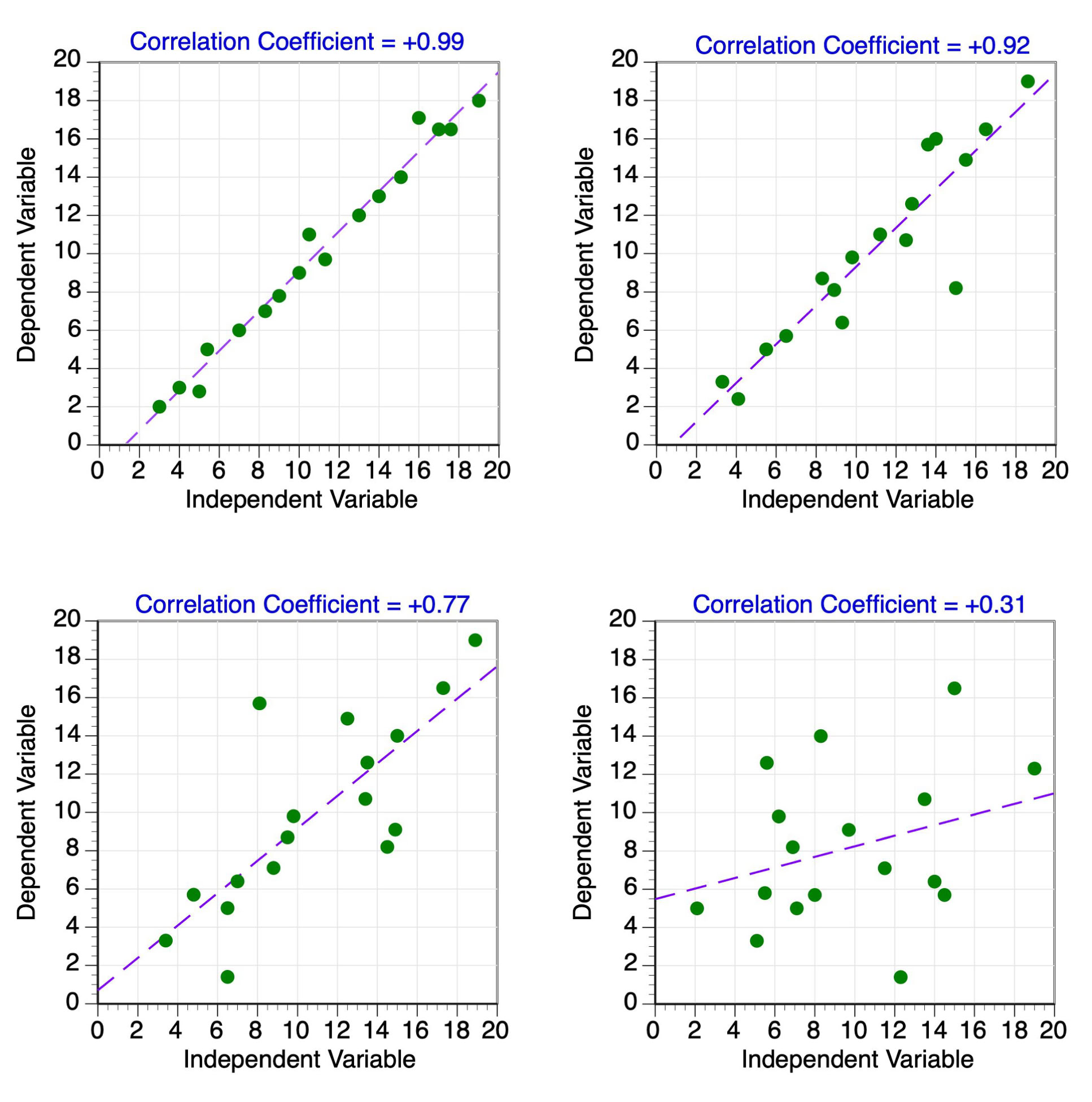
Figure 4 Four examples of data point distributions with varying positive correlation coefficient values. A best-fit regression line through the center of the data points is also shown.
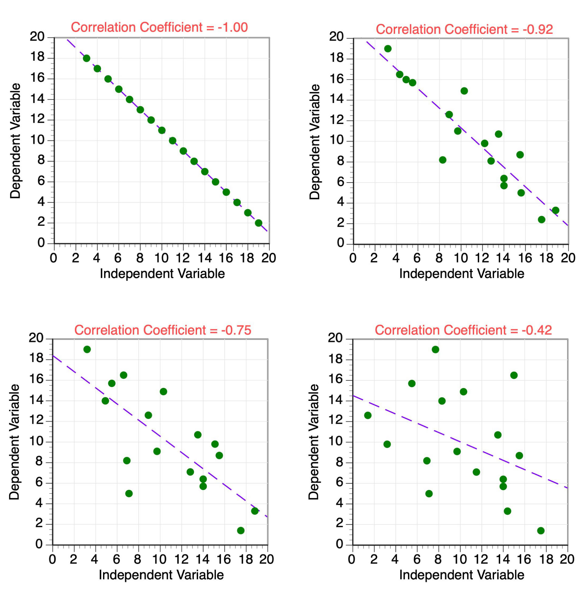
Figure 5 Four examples of data point distributions with varying negative correlation coefficient values. A best-fit regression line through the center of the data points is also shown.